COLOR ~ SCIENTIFIC SPECTRUM ANALYSIS


Science Museum Group. Draper's daguerreotype of Solar Spectrum. 1948-316 Science Museum Group Collection Online. https://collection.sciencemuseumgroup.org.uk/objects/co16983/drapers-daguerreotype-of-solar-spectrum.
The Tartan Ribbon or Further Experiments of Maxwell’s Disappointment/Sutton’s Accident
References
- Maxwell, J.C. 1. Experiments on Colour as perceived by the Eye, with Remarks on Colour-Blindness. Proc. R. Soc. Edinb. 1857, 3, 299–301. [Google Scholar] [CrossRef]
- Maxwell, J.C. On the Theory of Compound Colours and the Relations, of the Colours of the Spectrum. In The Scientific Papers of James Clerk Maxwell; Maxwell, J.C., Niven, W.D., Eds.; Cambridge Library Collection—Physical Sciences; Cambridge University Press: Cambridge, UK, 2011; Volume 1, pp. 410–444. [Google Scholar]
- Klein, S.; Elter, P.; Vazquez, A.T. Maxwell’s disappointment and Sutton’s accident. J. Phys. A Math. Theor. 2022, 55, 491002. [Google Scholar] [CrossRef]
- Maxwell, J.C.; Niven, W.D. (Eds.) On the Theory of Three Primary Colours. In The Scientific Papers of James Clerk Maxwell; Cambridge Library Collection—Physical Sciences; Cambridge University Press: Cambridge, UK, 2011; Volume 1, pp. 445–450. [Google Scholar]
- Ives, F.E.; Parry, J.W. The Perfected Photochromoscope and its Colour Photographs. J. Soc. Arts 1896, 44, 517–528. [Google Scholar]
- Sutton, T. Photographic Notes; Sampson Low, Son & Company: London, UK, 1861; pp. 169–170. [Google Scholar]
- Evans, R.M. Maxwell’s Color Photograph. Sci. Am. 1961, 205, 118–131. [Google Scholar] [CrossRef]
- Ray, S.F. Applied Photographic Optics, 3rd ed.; Focal Press: Oxford, UK, 2002. [Google Scholar]
- Ehrt, D. UV-absorption and radiation effects in different glasses doped with iron and tin in the ppm range. Comptes Rendus Chim. 2002, 5, 679–692. [Google Scholar] [CrossRef]
- Skladnikiewitz, P.; Hertel, D.; Schmidt, I. The wet collodion process—A scientific approach. J. Imaging Sci. 1998, 42, 450–458. [Google Scholar
The Light Farm
_______________________________________________________________
Assigning Colors to Victorian Fashion Photos
In going through my cabinet cards looking for sewing inspiration, and studying the different styles and fabrics used, my main thought usually is, "I wonder what color this dress is?" I know that there couldn't be that many black dresses out there, and I also know that what looks like a black dress could be vivid red. But is there a way to find out what colors these actually are?
There are people out there who are masters of photoshop and other programs, colorizing old photographs beautifully. But these are the artist's concepts of what they want to see. They may not be the actual color of the original.
First I must do a shout out to Olga of Klimbim. She does the best colorization of vintage photos I've ever seen, believable and soft. For example, this lovely, lovely early 1870s portrait. You can discover more photos on her facebook page https://www.facebook.com/klimbim.art/ She does have a website, however its in Russian. The photos are beautiful though!
Olga interprets this dress as pale blue. In reality, it could be any other color, including a darker color.


Below, Grand Duchess Anastasia Mikhailovna of Russia, colorized by Alixof Hesse


Above left is the original photo of the royal sisters Tsarina Maria Feodorovna of Russia, Queen Alexandra of the United Kingdom and Thyra, the Crown Princess of Hanover and Duchess of Cumberland and Teviotdale.
The photo on the left is colorized by Velkoknezna, also on Deviant Art. I even found another example by a third artist with different coloring.
Which colorway do you like best? More important, what are the ACTUAL colors of these dresses?
On the other side of the coin, you cannot take a color photo of a gown and use photoshop or another program to de-saturate it, and expect the results to match an original photograph.
Left, completely color de-saturated. Center, turned sepia. Right, the original dress.


I was curious to find out if a 19th century photo can be turned back into its original color by assigning colors to the values of its grey scale.
DISCLAIMER: I know nothing about photography, let alone 150 year old photography, so this post will be in layman's terms to the best of my limited understanding. Even after reading several articles, I still don't really understand the chemical equations and other science-y things.
Obviously, the easiest way to determine the actual color of an outfit is to find the original extant garment in the photograph in question.


By looking at the late 1870s dress above left, one might never guess its a beautiful, vibrant red. (from Antiquedress.com) Also note, the photo's coloring does not match the modern methods of de-saturation shown above. Compare the photo of the 1910s gown above right to the original dress. Its apparent the photography developing process has improved greatly in 40 years between these two examples, and different filters/exposures/techniques have been used.


Above left: Masquerade dress worn by the Grand Duchess Maria Pavlovna for the 1903 costume ball at the Winter Palace. Above right: Empress Maria Fyodorovna, designed by Charles Worth, Paris, 1890s. Gown located at The Hermitage.
 Photographers in the nineteenth century employed a wide variety of materials and processes; everything from honey to uranium found its way into one method or another. In some cases, there is no way to tell, short of exacting scientific analysis, just what sort of variation was use to obtain a specific result.
Look at the example to the left. Would you have thought the gown in the photograph was this deep plum color? The following paragraphs describe the processes used to achieve this.
Now, lets listen to the experts regarding color:
Black and white film records shades of gray 'logically'. If you take a b&w picture of a blue and yellow beach ball, you expect that the blue will record dark and the yellow light. Of course. Except, it wasn't always so. If you had asked someone (before) 1900 what a photograph of a blue and yellow beach ball should look like, they would have said the blue is light and the yellow dark. Their expectation of 'correct' was based on the colorblind film in use at the time — their technological/cultural frame.
The first silver gelatin negative was straight silver bromide and gelatin — a combination sensitive only to UV and blue/violet light. The blue on the beach ball exposed well — the yellow much less so. The print of the negative reversed the values and blue became light and yellow dark.
In 1884, Josef Eder discovered that erythrosin dye caused an emulsion to become sensitive to all light except deep orange and red. Blue eyes were no longer a ghostly white, but everyone still 'knew' that a woman's lips photograph black. The emulsion was dubbed ortho-chromatic, implying its 'correct' color balance. (This was a bit of premature marketing. When emulsions added the deep orange and red bands of the spectrum, marketers had to come up with a new name — panchromatic, meaning 'all colors'.) Orthochromatic emulsions and colorblind emulsions were in use simultaneously for years. At the time, colorblind plates were more commonly referred to as 'ordinary'.
That's the bare bones, but the whole picture was amazingly complex. Different brands and types of plates and films were sensitive to different exact wavelengths of light. Between orthochromatic and panchromatic is a whole range of red sensitivities. Back in the day, a typical photographer might have worked with a half dozen different films, and a dozen different filters to further tweak the materials. Link to awesome article


Above, original colors.
Right, the colorblind translation. Note how the red is black, and yellow is a very dark gray color. Early photos showing a dark dress may have really been sunshine yellow! The magenta and bright blue look off white.
As stated above, when Ortho emulsions were added, it corrected the colors quite a bit. Below are two photos, one colorblind and one with Ortho emulsions.

 You can see how the colors have been corrected, especially the on the two yellow tags, which look like black tags on the left (colorblind). The tags on the right are now closer to yellow, after using Ortho emulsions. For further photos of color charts with different filters and emulsions, please refer to the article link above.
Here is a photo of Dorothy Catherine Draper, sister of NYU professor John Draper and model for the
first daguerreotype portrait of a woman in the United States in 1839. She was the first woman to be photographed with her eyes open! source
The earliest American attempts in duplicating the photographic experiments of the Frenchman Louis Daguerre occurred at NYU in 1839. John W. Draper, professor of chemistry, built his own camera and made what may be the first human portrait taken in the United States, after a 65-second exposure. The sitter, his sister Dorothy Catherine Draper, had her face powdered with flour in an early attempt to accentuate contrasts.
To me, if this was shot "colorblind" (no filter), her dress and bonnet may be any color on the above chart that corresponds with "white". Its difficult to tell what she is holding in her arms, but I will guess maybe flowers? The dark flower heads could be yellow or red.
So colors were still pretty wonky (my tech term) in the early 1880s.
Finally, lets look at an article on modern photography about using color filters on black and white photography. Another awesome link Please read this article, they deserve the credit :)
A common problem in black and white photography is that certain colours look very similar when converted into greyscale. For example, some shades of red, green, and blue look completely different in colour, but almost identical in black and white. This can cause objects in a black and white image to blend into one another, leaving you with a photo which is flat and lifeless, and lacking in contrast and definition.
Coloured lens filters offer a solution to this problem because they affect the way colours are "converted" to black and white. This allows you to control the way they appear in the final image, ensuring that objects are well separated and clearly defined. There are 5 filter colours that are commonly used in black and white photography - red, orange, yellow, green, and blue. Each lets through its own colour of light and blocks other colours to varying degrees. For example, a red filter will let red light through, but block most green and blue.

It is possible to figure out what the colors in an old photo might have been, but its a lot of work and there are so many variables: The year the photo was taken and what developing processes were used. Was it shot colorblind, with an emulsion of some sort, or colored filters? Length of exposure, film type and so much more. As for me, I will continue to guess, look at colorized photos, or search for extant gowns on line.
, Grand Duchess Anastasia Mikhailovna of Russia, colorized by Alixof Hesse
 364
364 


 |
.webp)
.webp)


Tinting

The Making of a Daguerreotype, by Matthew R. R Isenburg
This illustrated brochure was prepared by Matthew Isenburg in conjunction with the exhibit Mirror with a Memory: The American Daguerreotype, on display at the Nelson-Atkins Museum of Art from October 13, 2001 through January 6, 2002, curated by Keith F. Davis.
Camera ca. 1854 on Iron Center Tripod
Palmer and Longking Daguerreotype
Camera ca. 1854 on Iron Center Tripod
Copyright 2001 by Matthew R. Isenburg
Hadlyme CT 06439-0189
Technical Assistance by Michael Robinson
This brochure intends to serve two purposes:
1) Primarily, by guiding the reader through the process step by step, it may help the beginner develop an understanding of the complexities, pitfalls and mysteries of daguerreotypy. Warning: Do not use this brochure to actually attempt the making of a daguerreotype. The chemical procedure is far too dangerous for the incomplete information provided here. It deals with the physical manipulations and timing more than the chemistry of the process to give the reader a general feeling rather than a highly technical demonstration. Through review, using pieces only contemporary to the period, the advanced observer may develop a better understanding of how the craft affected the art. Thus, this pictorial
The Daguerreian Society
↑
Member Portal Videos Store E-Mail List
Making A Daguerreotype
Video: Making of a Daguerreotype, by Takashi Arai
Japanese photographer and daguerreotypist Takashi Arai demonstrates the daguerreotype process at his studio. This video was made by Masafumi Ishikawa.
The Making of a Daguerreotype, by Matthew R. R Isenburg
This illustrated brochure was prepared by Matthew Isenburg in conjunction with the exhibit Mirror with a Memory: The American Daguerreotype, on display at the Nelson-Atkins Museum of Art from October 13, 2001 through January 6, 2002, curated by Keith F. Davis.
Camera ca. 1854 on Iron Center Tripod
Palmer and Longking Daguerreotype
Camera ca. 1854 on Iron Center Tripod
Copyright 2001 by Matthew R. Isenburg
Hadlyme CT 06439-0189
Technical Assistance by Michael Robinson
This brochure intends to serve two purposes:
1) Primarily, by guiding the reader through the process step by step, it may help the beginner develop an understanding of the complexities, pitfalls and mysteries of daguerreotypy. Warning: Do not use this brochure to actually attempt the making of a daguerreotype. The chemical procedure is far too dangerous for the incomplete information provided here. It deals with the physical manipulations and timing more than the chemistry of the process to give the reader a general feeling rather than a highly technical demonstration. Through review, using pieces only contemporary to the period, the advanced observer may develop a better understanding of how the craft affected the art. Thus, this pictorial instruction manual is offered for step by step making of a daguerreotype, utilizing only the finest examples of vintage equipment from the 1840s and the 1850s.
2) Through the photographs and information presented in this brochure, the reader will be able to identify and perhaps even rescue early equipment that might otherwise have been lost or forgotten. The very tools used for creating daguerreotypes are sculptural art in themselves and should be preserved and cherished along with the fascinating images they helped create.
THE PROCESS
It can be divided into many steps. In the interest of simplicity, both in this brochure and for display purposes, we chose to use five basic steps.
STEP I: PREPARING THE PLATE (20 to 25 minutes)
By far the most time consuming and labor intensive of the five-step process.
1) Remove a plate from the plate box (a).
2) If not pre-crimped in manufacture, use plate bender (b) to turn down edges. This takes less than a minute. Perfectly flat plates (c) were produced in the early years. Later, they were pre-bent at the edges (d) to aid insertion in a plate vice (i).
3) Remove buffing stick (e) from storage or warming box (f). Only one shown in this illustration, but each polishing agent gets its own buffer.
4) Vigorously scour the crimped plate (d) with powdered rotten stone (not illustrated) to remove surface imperfections.
5) Rub chalk rouge (g) on deerskin side of buffing stick (e).
6) Much more common was powdered rouge (h). Sprinkle on buffing stick and rub powder into surface of the hide (e).
7) Install plate in Benedict’s plate holder (i), one of many gadgets sold commercially for securing the plate while buffing.
8) The entire assembly is clamped onto a wooden table vise (j). The vise is fastened to the table or bench. Now polish or buff the plate (always in the horizontal direction of what will be the finished image) for about 20 minutes to get a perfect mirror finish. The use of a treadle driven buffing wheel could measurably shorten the time of this step.
9) Lime from these bottles (k) is used to bed or cradle the bromine in the bottom of the glass tray which is inside the second coating box (n).
10) Insert buffed plate (m), face down in the sliding cover which is double the length of the box, and slide the plate into position over box containing iodine (l). When the plate turns light yellow, (usually about 15 to 25 seconds) remove from this box. The iodine stays good for years when kept in its sealed coating box so it is always ready to be used.
11) Move the plate (m) to the bromine box (n) and slide into position for approximately 5 to 10 seconds till the plate turns rose colored. When this takes over 15 seconds, the bromine (or quick stuff) has weakened and a pinch more should be added to freshen up the existing chemical. It will then stay potent for months.
12) Now in darkness, return plate to the iodine box (l) for a few seconds. This completes the coating, and you now have a properly sensitized plate.
13) Insert polished and sensitized plate in a plateholder (o) and close dark-slide, (shown partially open in this illustration).
14) All polishing except for the quick final buff of the plate with lampblack (not illustrated) is done in advance so the sitter can enter the studio and receive a finished likeness in less than thirty minutes!
STEP II: TAKING THE EXPOSURE (2 to 8 minutes)
1) Place the camera (a) on a tripod, (see Illustration Page 1).
2) Open trap doors (b) and (c) on top of camera .
3) Remove lens cap (d) from front of lens (e).
4) Insert the ground viewing glass (f) in open slot on camera top.
5) Focus lens (e) and compose your subject in its frame until you are satisfied. This usually takes more time than the actual exposure. Lightly replace lens cap (d).
6) Remove the viewing glass (f) from camera (a) and replace with the loaded plateholder (g) with dark-slide (h) in down position. (Though in the illustrated detail of this layout, an extra plateholder (g&h) is displayed partially drawn up in order to show the polished and sensitized daguerreotype plate’s position (i) within the plateholder (g).
7) With the plateholder in the camera, pull up the dark-slide as far as possible (h2), then remove and replace the lens cap (d), using it as the shutter. Normally indoors with good light this takes from ten to twenty seconds though most operators advertised much quicker exposure times to lure the gullable. If the advertising were to be believed, there would have been no need for headstands (see Illustration, Item 4).
8) Drop the dark-slide (h2) tob secure the exposed plate from any further light and remove the plateholder from the camera.
STEP III: DEVELOPING, FIXING AND GILDING THE DAGUERREOTYPE (6 to 10 minutes)
1) Pour a small amount of mercury (a) into the cast iron fuming box (b).
2) In a vented dark room, light glass alcohol lamp (c).
3) Center the lamp on cast iron base under the bottom tip of inverted pyramid, slip thermometer (not illustrated) into the side slot (d) and heat mercury to approximately 175 degrees Fahrenheit.
4) With plate (e) face down on the heated fuming box (b), the image will develop by exposure to the fumes. This is where experience is necessary, since only trial and error can tell you when the plate is ready. In general this usually takes from 2 to 3 minutes.
5) In the glass tray (f) filled with hypo-sulfate, immerse plate face-up to arrest further chemical action. (This removes all the remaining light-sensitive chemicals).
6) Pour distilled water from bottle (g) over plate a few times in another tray to further remove unwanted chemicals.
7) Place plate (j) on gilding stand (h) and adjust screws to level the image so gold chloride won’t run off the plate when applied. This is more important with larger plates, since smaller plates can be leveled quite easily using hand pliers to grasp plate by its corner with no run off of liquid.
8) Light the Holmes Booth and Haydens brass spirit lamp (i) and gently pour on the gold chloride, which when heated, bonds to the silver image. This hardens the surface of the image (j) and makes it richer in tone.
STEP IV: HAND COLORING THE IMAGE This step is optional. (2 to 10 minutes)
1) Open the coloring box and choose the appropriate bottles of finely powdered colors (a).
2) Install on palette (b) as needed.
3) To mix colors use the white fabric interior of lid (c).
4) With a fine brush (d), sparingly stipple the dry color directly on the developed plate. Use squeeze bulb (not illustrated) to remove excess pigment. A soft brush or cotton can be used to soften and blend the color applied to the cheeks. Some suggest breathing gently on the plate to make the dry powders adhere more readily.
5) The most common request is for tinting of the woman’s lips and cheeks. There are two extra cylindrical wood containers of powdered colors labeled "CARMINE" and "LADIES FLESH COLOR" (e) since they are in such high demand.
6) The two small enamel dishes (f) are for applying liquid gold or silver on the plate to accentuate jewelry, gold objects or gold braid on clothing
7) A small prick or hand-punch tapped directly on the plate could be further used to accent diamonds, pearls or other jewelry. (Not illustrated)
8) Sixth plate daguerreotype (g), maker unknown, ca. 1853 of a man tinting an image using an outfit identical to the one in the illustration. To its right is shown a tinted sixth plate daguerreotype (h), maker unknown, ca. 1853 of an actor, wearing a red and grey tunic adorned with gilded trimmings showing an example of both hand coloring and gilding.
STEP V: PROTECTING, PRESERVING AND PRESENTING THE FINISHED PRODUCT (2 to 4 minutes)
1) Wafer a brass mat (b) between the image (a) and a glass rectangle of the same size (c) as shown in the exploded daguerreotype on left.
2) Remove proper amount of sealing paper from roll (d1). Apply glue to one side of sealing paper (d) and place around edge of the glass, then fold backwards and press on back of plate. It is now a sealed daguerreotype.
3) Remove frame-like mat preserver from open stack (e1) or one half gross box (e2) and encase and wrap around the sandwiched layers of image, mat, glass and seal. Mat preservers first came into common usage ca. 1847.
4) From rear it should now look like (f). From front it should look like (g).
5) Insert in case (h) and present to recipient. Please note that usually the velvet or satin is on the left (i) and the image is inserted on the right (j).
FAQ
Making A Daguerreotype
Useful Links
Bibliography
Daguerreian Annual Tables Of Contents
Daguerreian Annual Index
Webinars / Educational Programs
The Society regularly organizes educational programs exploring various aspects of the history, technology, art, and preservation of 19th-century photography.
The Dagguerreian Society
The Daguerreian Society
PO Box #306
Cecil, PA 15321-0306
Phone: 412-221-0306
All Rights Reserved © 2023 The Daguerreian Society
Resources
https://www.daguerreiansociety.org/Making-a-Daguerreotype
Pigments:
Guerra Paint and Pigment Corp. 21 Wythe Ave, Brooklyn, NY 11249 https://www.guerrapaint.com/
Kremer pigments. 247 W 29th St, New York, New York 10001
https://shop.kremerpigments.com/us/


Thomas Reeves and Son 80 Holborn Bridge, London. watercolor boxes: http://www.whimsie.com/t%20reeves%20and%20son%20watercolor%20paint%20box%201784%20to%201794.html

This rare late 18th.Century Sheraton style mahogany artists paint box bears the original maker's label for "Reeves & Inwood" and states "Superfine Colour Preparers" to the Royal Family and Academies at The King's Arms & Blue Coat Boy and 300 New Church, Strand, London. The good quality box is inlaid with satinwood between boxwood and ebony stringing with boxwood corners and edging. It has silver plated carrying handles with ivory escutcheon and turned drawer pulls. The Moroccan leather lined lid lifts to a well fitted interior which includes 8 glass bottles and stoppers (1 or 2 chipped), a lift out paint tray with original labels and later watercolour tablets, a removable tray with 6 porcelain paint mixing bowls, 9 small, old paint jars and 2 Moroccan leather and ivory lidded compartments. The drawer is released by a brass bolt located in the top edge and contains a white porcelain paint mixer and several compartments. A rare item in very good condition and still retaining many original features. Size:- Width..12''...30.5cm. Depth..8.5''...21.5cm. Height..3.75''...9.5cm. Free delivery to most of U.K.

Reeves and Inwood Reeves & Inwood Watercolour Box of impressive size, c.1800. William Reeves was a colour manufacturer who lived in Islington he took John Inwood as an apprentice in September 1787 and then into partnership by 1796 when they advertised their products, they had ceased to trade by 1816. The present box can be dated fairly accurately to between 1796 and sometime before 1816. On the trade label, Reeves & Inwood are described as: ‘Superfine colour preparers’ and listed as having premises at 299 Strand. The label depicts a ‘Blue Coat Boy’, or pupil at Christ’s Hospital, which had a long tradition of appointing drawing master’s throughout the eighteenth century, including members of the Lens family of miniaturists and Alexander Cozens who was appointed in 1749.
The label also lists Reeves & Inwood as the winners of a ‘Bounty’ from the Society for the Encouragement of Arts, Manufactures and Commerce for ‘their invention of superfine water colours in cakes’. In 1781 Thomas and William Reeves submitted a box containing watercolour in cakes to the Society for the Encouragement of Arts, Manufactures and Commerce. The society referred the cakes to a panel of artists for assessment, and their comments were enthusiastic as the cakes of colour were more economical to use than anything previously marketed and the chemical composition of the pigments was markedly an improvement on those of existing products. The portability of Reeves’s new watercolour cakes made them ideal for artists who wanted to take them on tour and to work out of doors, en plein air. It is notable that George Raper, the First Fleet artist who recorded the flora and fauna of newly settled Australia, travelled with a Reeves box. Our example is well preserved with a good set of period watercolour cakes and an amazingly complete set of internal fittings.

[Stationery and vintage art supplies]. W.J. Reeves & Woodyer. Boxed travel or outdoor watercolour set, Mahogany box w. hinging lid (22x17x6 cm.), inside w. compartments for i.a. 12 paint blocks (w. printed strips w. colour names mounted on compartment edges), the contens listed below, inside lid w. mounted engr. publisher's vignette (15,5x19,5 cm.), London, W.J. Reeves & Woodyer, ±1800. - Used box. Lacks the glass washing bowl; most paint blocks from manufacturers other than Reeves & Woodyer, in partial/ fragmented form, the manufacturer's stamps illegible; publisher's vignette stained; one box hinge broken (box still tight and strong). = Nice comprehensive outdoor watercolour set, containing five rather intact paint blocks (1x from Reeves & Woodyer) and many fragments, 3 china palettes, 7 brushes (4x wood and metal, 2x (partly) made of a porcupine quill), a small glass bottle w. gold colouring on inside, a few pieces of charcoal/ crayon, a small cylindrical board box containing blue powder (publ. ticket on lid: "Magazijn van Schrijfbehoeften S. Benedictus (...) Rotterdam"), a metal quill's top, two parts/ remnants of paint tubes (from German manufacturers), a paint-stained piece of cloth,

Winsor and Newton , Rathbone Place, Artist's Watercolor / Paint Box, circa 1885


R. Ackerman

G. Rowney & Co. label. The tray holding the paint has the label of Rowney, Dillon Rowney which makes this box a transitional box when George Rowney took on the partner Mr. Dillon with His son (Ro


FRENCH


Fabulous antique French Bourgeois Aine artist's watercolor paint box, a 3-tier expanding chest with lots of original contents! These almost always sell as quickly as we find and list them, whether it's for the antique French paints inside or to use as a decorative accent. This one quite unique with the scroll cut hinges at the sides and three levels of fittings, porcelain mixing palettes, glass covered jars and more. The box, several pieces and even some of the paints bear the marking of Bourgeois Aine, a prominent French maker of paints and kits. The diamond-shaped logo featuring the letter "B" flanked by caducei, with the words "PARIS" at top and "DÉPOSÉ" at bottom is for Bourgeois Ainé, an artist supply shop once located in Paris near the Musée du Louvre.
Before opening the store in 1867, its founder François Alexandre Joseph Bourgeois (b. 1830) had invented alizarin lacquer, which led to the production of some of the first nontoxic paints. By 1898, Bourgeois Ainé was operating out of a storefront located at 18 rue Croix des Petits Champs (now 24 rue des Petits-Champs) and was affiliated with three factories in the outskirts of Paris. The shop's inventory expanded to include tubes of paint as well as a full array of artist supplies, ranging from specially designed paint boxes, brushes, pastels, watercolors, and easels, to stools, shade umbrellas, and a variety of canvases (including the wooden frame that supports the canvas of Picasso's The Scallop Shell: "Notre Avenir est dans L’Air”, c.1912).
Exposition awards :
• 1873 Vienne (médaille de mérite)
• 1876 Philadelphie (médaille)
• 1878 Paris (médaille d'argent)
• 1889 Paris (2 médailles d'or, 1 médaille d'argent)
• 1900 Paris (3 médailles d'or)
• 1904 Saint-Louis (Grand Prix)
• 1906 Milan (Grand Prix)
• 1907 Bruxelles (Grand Prix)
• 1908 Londres (Grand Prix)
Very good condition. As you can see, the clasp on the front of the box is missing but the rest is in great shape, the wood is maple I think. The contents are just as they appear in the images, most of the watercolor paint tiles have been used somewhat, some more than others. A few missing items surely but quite a few intact. See pictures for all measurements.


art material making companies (https://inbedwithmonalisa.com/links-to-all-pages/)
Jacques Blockx at the Blockx factory (Belgium)
Jim Cobb from the Chroma factory (Sydney, Australia)
the Coates dynasty (Stoke-St-Gregory, Somerset, England)
The Daniel Smith factory (Seattle, U.S.A.)
two generations of Escodas (Barcelona, Spain)
166 Golden owners (New Berlin, New York, U.S.A.)
Art Guerra from Guerra Paint and Pigment Corp. (New York City, New York, U.S.A.)
Houkodou a brush making company in Kumano, Japan
The Kobaien sumi ink factory (Nara, Japan)
David Coles (and Louise!) at Langridge Artists Colours (Melbourne, Australia)
David Coles (in-depth interview) from Langridge Artists Colours (Melbourne, Australia)
R & F, aka Richard Frumess (Kingston, New York, U.S.A.)
Isabelle Roché & Margaret Zayer from La Maison du Pastel (Paris, France)
Dominique Sennelier from Sennelier (Paris, France)
Daniel Smith, aka John Cogley (Seattle, U.S.A.)
This is an advertisements but I really like this lady and her presentation. I have been reading about the chemistry of how they tinted early dageurreotype photographs and I love this ladies explanation and delivery.
Veridian green: https://m.facebook.com/reel/134881082947231/?referral_source=external_deeplink
Burnt umber, burnt sienna, (iron oxide) https://www.facebook.com/reel/638463388019626?mibextid=UT8rzV
Verdachio technique from the Renaissance, red lake glaze, green earth: https://www.facebook.com/reel/685655926723243?mibextid=UT8rzV
Venetian red: https://www.facebook.com/reel/849087346625534?mibextid=UT8rzV. Article: https://www.jacksonsart.com/blog/2022/08/31/venetian-red-the-red-earth-pigment-that-evokes-the-italian-renaissance/?fbclid=IwAR12FPpLmhDd3tL3zSnAzojBh7U5DgItFRlhuVkg3OsKau5mwvyVsN7Zczg
Potter's pink for granulation in watercolor: https://www.facebook.com/reel/127888056980810?mibextid=UT8rzV
Lead tin yellow and 1960's nickel tintinate: https://www.facebook.com/reel/676744530943100?mibextid=UT8rzV
Prussian blue and binder ph: https://www.facebook.com/reel/1019685709060689?mibextid=UT8rzV
Screen printing: https://www.facebook.com/reel/5401572109953186?mibextid=UT8rzV
Screen Inks: https://www.facebook.com/reel/1401708363631060?mibextid=UT8rzV
Oil quality: https://www.facebook.com/reel/445562264098255?mibextid=UT8rzV
Acrilic: https://www.facebook.com/reel/726390332111706?mibextid=UT8rzV
Venice and the pigment trade
MOSES WARREN AND THE QUINENBERG GOLD COMPANY, Mark S. Johnson Dag Soc. 2012.
Assigning Colors to Victorian Fashion Photos
In going through my cabinet cards looking for sewing inspiration, and studying the different styles and fabrics used, my main thought usually is, "I wonder what color this dress is?" I know that there couldn't be that many black dresses out there, and I also know that what looks like a black dress could be vivid red. But is there a way to find out what colors these actually are?
There are people out there who are masters of photoshop and other programs, colorizing old photographs beautifully. But these are the artist's concepts of what they want to see. They may not be the actual color of the original.
First I must do a shout out to Olga of Klimbim. She does the best colorization of vintage photos I've ever seen, believable and soft. For example, this lovely, lovely early 1870s portrait. You can discover more photos on her facebook page https://www.facebook.com/klimbim.art/ She does have a website, however its in Russian. The photos are beautiful though!
Olga interprets this dress as pale blue. In reality, it could be any other color, including a darker color.
Below, Grand Duchess Anastasia Mikhailovna of Russia, colorized by Alixof Hesse
Above left is the original photo of the royal sisters Tsarina Maria Feodorovna of Russia, Queen Alexandra of the United Kingdom and Thyra, the Crown Princess of Hanover and Duchess of Cumberland and Teviotdale.
The photo on the left is colorized by Velkoknezna, also on Deviant Art. I even found another example by a third artist with different coloring.
Which colorway do you like best? More important, what are the ACTUAL colors of these dresses?
On the other side of the coin, you cannot take a color photo of a gown and use photoshop or another program to de-saturate it, and expect the results to match an original photograph.
Left, completely color de-saturated. Center, turned sepia. Right, the original dress.
I was curious to find out if a 19th century photo can be turned back into its original color by assigning colors to the values of its grey scale.
DISCLAIMER: I know nothing about photography, let alone 150 year old photography, so this post will be in layman's terms to the best of my limited understanding. Even after reading several articles, I still don't really understand the chemical equations and other science-y things.
Obviously, the easiest way to determine the actual color of an outfit is to find the original extant garment in the photograph in question.
DISCLAIMER: I know nothing about photography, let alone 150 year old photography, so this post will be in layman's terms to the best of my limited understanding. Even after reading several articles, I still don't really understand the chemical equations and other science-y things.
Obviously, the easiest way to determine the actual color of an outfit is to find the original extant garment in the photograph in question.
By looking at the late 1870s dress above left, one might never guess its a beautiful, vibrant red. (from Antiquedress.com) Also note, the photo's coloring does not match the modern methods of de-saturation shown above. Compare the photo of the 1910s gown above right to the original dress. Its apparent the photography developing process has improved greatly in 40 years between these two examples, and different filters/exposures/techniques have been used.
Photographers in the nineteenth century employed a wide variety of materials and processes; everything from honey to uranium found its way into one method or another. In some cases, there is no way to tell, short of exacting scientific analysis, just what sort of variation was use to obtain a specific result.
Look at the example to the left. Would you have thought the gown in the photograph was this deep plum color? The following paragraphs describe the processes used to achieve this.
Now, lets listen to the experts regarding color:
Black and white film records shades of gray 'logically'. If you take a b&w picture of a blue and yellow beach ball, you expect that the blue will record dark and the yellow light. Of course. Except, it wasn't always so. If you had asked someone (before) 1900 what a photograph of a blue and yellow beach ball should look like, they would have said the blue is light and the yellow dark. Their expectation of 'correct' was based on the colorblind film in use at the time — their technological/cultural frame.
The first silver gelatin negative was straight silver bromide and gelatin — a combination sensitive only to UV and blue/violet light. The blue on the beach ball exposed well — the yellow much less so. The print of the negative reversed the values and blue became light and yellow dark.
In 1884, Josef Eder discovered that erythrosin dye caused an emulsion to become sensitive to all light except deep orange and red. Blue eyes were no longer a ghostly white, but everyone still 'knew' that a woman's lips photograph black. The emulsion was dubbed ortho-chromatic, implying its 'correct' color balance. (This was a bit of premature marketing. When emulsions added the deep orange and red bands of the spectrum, marketers had to come up with a new name — panchromatic, meaning 'all colors'.) Orthochromatic emulsions and colorblind emulsions were in use simultaneously for years. At the time, colorblind plates were more commonly referred to as 'ordinary'.
That's the bare bones, but the whole picture was amazingly complex. Different brands and types of plates and films were sensitive to different exact wavelengths of light. Between orthochromatic and panchromatic is a whole range of red sensitivities. Back in the day, a typical photographer might have worked with a half dozen different films, and a dozen different filters to further tweak the materials. Link to awesome article
So the "colorblind", or non-filtered early photographs, would make it quite difficult for us to make out any true colors. The above article shows us a chart of how this colorblind photography affects colors.Above, original colors.
Right, the colorblind translation. Note how the red is black, and yellow is a very dark gray color. Early photos showing a dark dress may have really been sunshine yellow! The magenta and bright blue look off white.
As stated above, when Ortho emulsions were added, it corrected the colors quite a bit. Below are two photos, one colorblind and one with Ortho emulsions.
You can see how the colors have been corrected, especially the on the two yellow tags, which look like black tags on the left (colorblind). The tags on the right are now closer to yellow, after using Ortho emulsions. For further photos of color charts with different filters and emulsions, please refer to the article link above.Here is a photo of Dorothy Catherine Draper, sister of NYU professor John Draper and model for the
first daguerreotype portrait of a woman in the United States in 1839. She was the first woman to be photographed with her eyes open! source
The earliest American attempts in duplicating the photographic experiments of the Frenchman Louis Daguerre occurred at NYU in 1839. John W. Draper, professor of chemistry, built his own camera and made what may be the first human portrait taken in the United States, after a 65-second exposure. The sitter, his sister Dorothy Catherine Draper, had her face powdered with flour in an early attempt to accentuate contrasts.
To me, if this was shot "colorblind" (no filter), her dress and bonnet may be any color on the above chart that corresponds with "white". Its difficult to tell what she is holding in her arms, but I will guess maybe flowers? The dark flower heads could be yellow or red.
So colors were still pretty wonky (my tech term) in the early 1880s.
Finally, lets look at an article on modern photography about using color filters on black and white photography. Another awesome link Please read this article, they deserve the credit :)
A common problem in black and white photography is that certain colours look very similar when converted into greyscale. For example, some shades of red, green, and blue look completely different in colour, but almost identical in black and white. This can cause objects in a black and white image to blend into one another, leaving you with a photo which is flat and lifeless, and lacking in contrast and definition.
Coloured lens filters offer a solution to this problem because they affect the way colours are "converted" to black and white. This allows you to control the way they appear in the final image, ensuring that objects are well separated and clearly defined. There are 5 filter colours that are commonly used in black and white photography - red, orange, yellow, green, and blue. Each lets through its own colour of light and blocks other colours to varying degrees. For example, a red filter will let red light through, but block most green and blue.
It is possible to figure out what the colors in an old photo might have been, but its a lot of work and there are so many variables: The year the photo was taken and what developing processes were used. Was it shot colorblind, with an emulsion of some sort, or colored filters? Length of exposure, film type and so much more. As for me, I will continue to guess, look at colorized photos, or search for extant gowns on line
Orthochromatic Emulsions — Background and BasicsJanuary 15, 2012 |
It is a fact that we all take for granted. Black and white film records shades of gray 'logically'. If you take a b&w picture of a blue and yellow beach ball, you expect that the blue will record dark and the yellow light. Of course. Except, it wasn't always so. If you had asked someone in 1900 what a photograph of a blue and yellow beach ball should look like, they would have said the blue is light and the yellow dark. Their expectation of 'correct' was based on the colorblind film in use at the time — their technological/cultural frame. The first silver gelatin negative was straight silver bromide and gelatin — a combination sensitive only to UV and blue/violet light. The blue on the beach ball exposed well — the yellow much less so. The print of the negative reversed the values and blue became light and yellow dark. In 1884, Josef Eder discovered that erythrosin dye caused an emulsion to become sensitive to all light except deep orange and red. Blue eyes were no longer a ghostly white, but everyone still 'knew' that a woman's lips photograph black. The emulsion was dubbed ortho-chromatic, implying its 'correct' color balance. (This was a bit of premature marketing. When emulsions added the deep orange and red bands of the spectrum, marketers had to come up with a new name — panchromatic, meaning 'all colors'.) Orthochromatic emulsions and colorblind emulsions were in use simultaneously for years. At the time, colorblind plates were more commonly referred to as 'ordinary'. That's the bare bones, but the whole picture was amazingly complex. Different brands and types of plates and films were sensitive to different exact wavelengths of light. Between orthochromatic and panchromatic is a whole range of red sensitivities. Back in the day, a typical photographer might have worked with a half dozen different films, and a dozen different filters to further tweak the materials. |
 I'll start with one of our current technological/cultural expectations of a black and white image — the desaturated color digital file.  |

And the inversion/negative. The black and white values pretty much fit our expectations. Yellow is bright. Blues, greens, and red all have about the same value. The light shining on half the color card messed with the densities more than I anticipated (the gottcha of reflectance). |

Here's the card photographed in even shade and desaturated. To me it 'feels' wrong. There isn't enough difference in the brightness levels. The oranges and yellow-green should be brighter. The dark blue should be darker. I have no idea whether my expectations are based in physical facts or on an expectation of 'reality' based on my experience with B&W panchromatic film. It doesn't matter. I can change the values in post-processing. Our 'back-in-the-day' photographers did it with film choice and filters. Artisan emulsion makers have the last century of photography to play with. |
An ordinary/colorblind emulsion, like 'TLF#2', is sensitive to UV and blue/violet light. If you add a spectral sensitizer, you will pick up an extra band of color, but the emulsion will still be over-sensitive to blue. With orthochromatic emulsions a yellow filter is required for full effect. The filter holds back blue light exposure and allows yellow and green light more time to expose the negative. Unfortunately, a price is paid in 'speed'. A medium-yellow filter will increase exposure time 1x - 3x.  |
Note: I'll be comparing a lot of ColorChecker Charts in the coming months, so I've settled on a simple, repeatable protocol, not necessarily intended to produce the most pleasing print. The negative is a straight scan at 4000 d.p.i. The full print is crop, invert, and auto-contrast. Since shadows are always the default black point, the chart black will almost never be as dark, so I'll make a last crop of the chart alone and set the black point on the black square. All other values fall automatically from that. |
 Left: The GretagMacbeth ColorChecker photographed with colorblind 'TLF#2'.  |
 And an ortho variation exposed without a filter (left) and with a medium yellow filter (below).  |
Comparing Photoshop methods of Converting a Colour image to Black and White. |
| In Photoshop there are numerous ways of converting a Colour image to Black and White and in this article I will discuss the advantages and disadvantages of a few of the main methods. |
Here are the methods we are going to compare. |
1. DESATURATE |
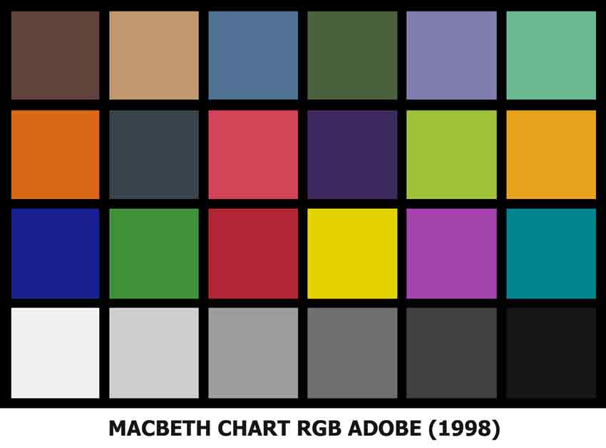 | This image, that we will use for the comparisons is a digital version of GretagMacbeth ColorChecker Chart |
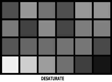 | This is the result of converting by DESATURATING the Colour Image by using Image/Adjustments/Desaturate. Verdict: |
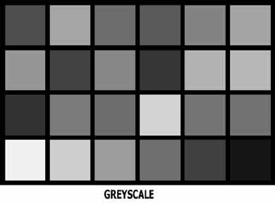 | This is the result of converting the colour image to GREYSCALE by selecting Image/Mode/Greyscale. Verdict: |
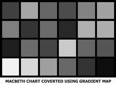 | This is the result of converting by using a GRADIENT MAP Adjustment Layer. |
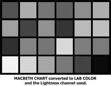 | This is the result of converting the Image to LAB COLOR, selecting the Lightness channel only and converting the image back to greyscale. Verdict: https://www.photoshopessentials.com/photo-editing/black-and-white-tutorials/lab-color/ |
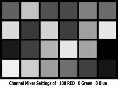 | This is the result of converting by using a Channel Mixer adjustment layer at Photoshop default of 100% Red Layer/New Adjustment Layer/Channel Mixer, then tick the Monochrome box and click on OK. This is a good quick method of getting punchy results and because it maintains the colour information, the tones can be modified by applying other layers such as Hue and Saturation. Verdict: Can produce good results like B&W film taken with a red filter on the lens, but lacks finesse when needed. |
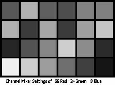 | This is the result of converting by using a Channel Mixer adjustment layer.
|


Bibliography
Constance A. Lubbock. 1938. A Short Biography of Sir John F.W. Herschel. Cambridge: Privatdruck.
Hentschel, Klaus. 2002. Mapping the Spectrum: Techniques of Visual Representation in Research and Teaching. Oxford; New York: Oxford University Press.
Millman, Peter Mackenzie. 1980. ‘The Herschel Dynasty; Part I: William Herschel; Part II: John Herschel; Part III: Alexander Stewart Herschel.’ Reprinted from Journal of the Royal Astronomical Society of Canada, 74(3-4-5), 1980, 134-146; 203-215; 279-290.
Moore, Keith. 2008. ‘Photographs by the French Scientist Henri Victor Regnault’. Notes and Records of the Royal Society 62 (4): 409–13. https://doi.org/10.1098/rsnr.2...;
Schaaf, Larry. 1979. ‘Sir John Herschel’s 1839 Royal Society Paper on Photography’. History of Photography 3 (1): 47–60. https://doi.org/10.1080/030872....
Schaaf, Larry J. 1992. Out of the Shadows: Herschel, Talbot & the Invention of Photography. New Haven: Yale University Press.
Wilder, Kelley. 2024. ‘Photology, Photography, and Actinochemistry: The Photographic Work of John Herschel’. In The Cambridge Companion to John Herschel, edited by Stephen Case and Lukas M. Verburgt, 1st ed., 160–85. Cambridge University Press. https://doi.org/10.1017/978100...;
Wilder, Kelley, and Martin Kemp. 2002. ‘Proof Positive in Sir John Herschel’s Concept of Photography’. History of Photography 26 (4): 358–66. https://doi.org/10.1080/030872...;
Susan Barger and William B. White, The Daguerreotype

.webp)
Comments
Post a Comment